Water
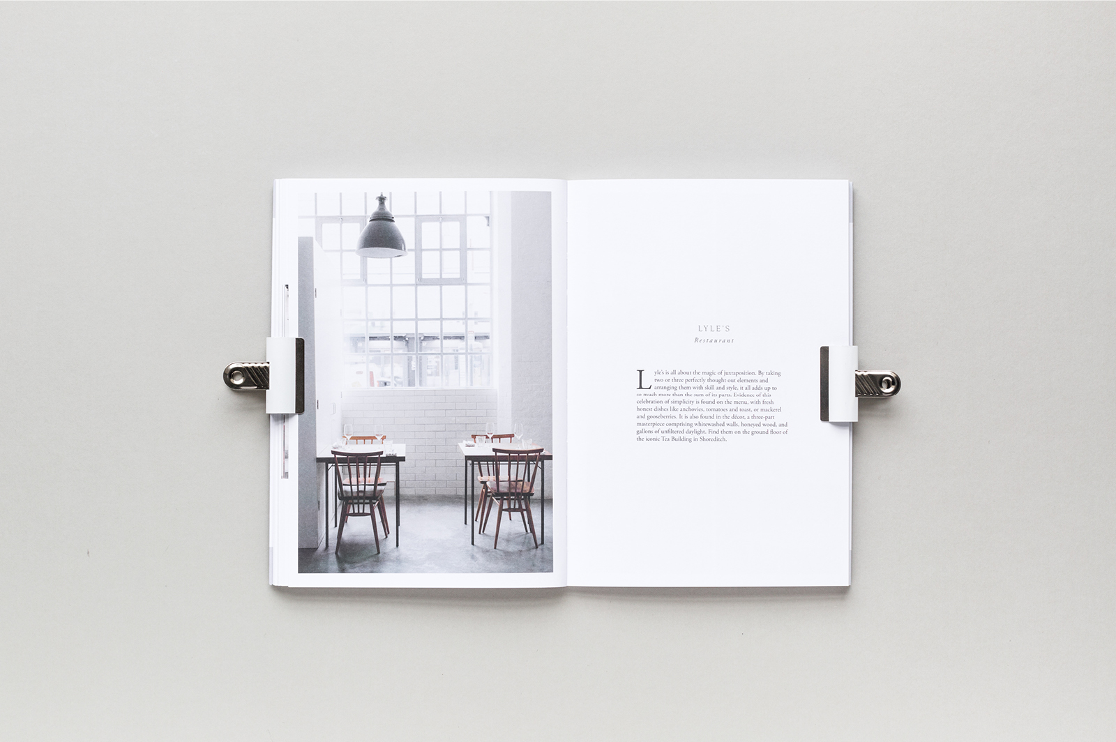
-Minimal Layout, black and white colour scheme with perfect bound.


Lementum


Cereal
-Minimal Layout, black and white colour scheme with perfect bound.

- Minimal layout, Perfect bound, Soft colour way.
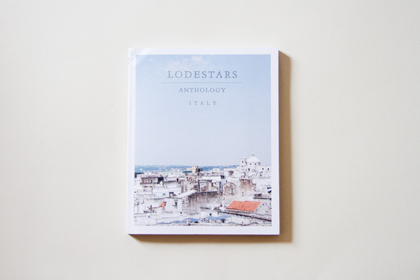
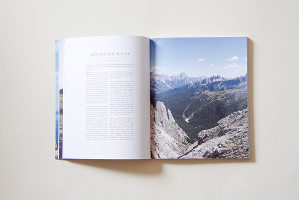
lodestars
- Full bleed, modern layout, contemporary, visually impactful, perfect bound.
From all the publications Hannah referenced it instantly becomes evident to the kind of aesthetic and stylistic approach she wants for her zine. All publication above is contemporary, modern and minimal demonstrating the minimal use of layout, type, colour and layout; all properties of a trend you see in most publication within independent book shops such as Village Bookshop. The references become extremely useful as it makes the research process quicker as I already know the style of publication to look for and to avoid all other publication styles which aren't contemporary and that also leads on to avoiding bookshops that don't sell contemporary book/zines and publication such as Waterstones and WHSmiths.
No comments:
Post a Comment