Theme or collateralWhen we talk about Concepts they are often regarded to the implementation and selling of a certain message that is collectively represented throughout one's design or campaign. It's often abstract but delivers a very real and deep message intended for the target demographic to connect and engage with the campaign.
For the Creative Networks brief, a deep conceptual approach wasn't needed due to the nature of the work. We didn't need to sell a product or inject any kind of the persuasive meaning within the design. Concepts would normally be applied to advertising where there is a product to sell to the consumer, in this case, we were simply promoting an event and not selling anything of value. Essentially the event isn't significant enough for the need of a concept. The only type of strategy applied that could be similar to a concept was a theme. The theme applied to the promotional event branding was a distinctive rectangle used as the main element and visual throughout all of the collateral on the leaflets, flyer, and animation. To understand how the rectangle can be applied to the collateral we can, for instance, take the posters, the featured rectangle would be predominantly positioned on the page with imagery around it to add a visual stimulant and a chance to represent the speaker through showcasing their work. This representation of showcasing their work will immediately gather interest and recognition from fans and by passers-by who are interested in that particular style.
To ensure the success of the theme and consistency the rectangle will be used for the leaflets and flyers giving the illusion that the leaflet has been taking out of the posters, giving a sense of connection and succinctness. This same design decision would also be incorporate into the animation. The rectangle would be used as a demonstration of hierarchy, to announce/highlight information.
Thursday, 16 February 2017
EP // BRIEF2 // PENGUIN // FINAL COVER
Below you can see the finish and final book design cover for Penguin. The overall success of the cover came down to its conceptual exploration of racial discrimination at every level. Features within the book that link to racial discrimination are:
Protest song - The protest song was in connection with the most common known thing about the mockingbird, it's ability to mimic sounds from other birds. Therefore, the bird is seeing and mimicking the harsh reality of black people in the 1930's America.
Layout and arrangement of type - The type is position vertical for two reasons. The first is to ensure the reader's eyes are moving from top to bottom giving them the best opportunity to see all elements of the page. Secondly, the ability to subtly make the elements of the page look like a face. The face of Tom Robinson, the man who was wrongly convicted and the man who the whole concept has been based around. It's his story and his fight against the common white man.
The book was set in America in the 1930's so apart from the book links back to this time. Therefore, the book incorporates a feel of the 1930's through the vintage texture used within the background and the serif typeface, again representing a classic and timeless atmosphere. Lastly, the colour scheme and overall layout are deliberately injected into the overall cover to guarantee the book links back to a new generation of readers. Therefore, the book still has a contemporary layout to reach out to a contemporary demography. This is achieved through the minimal colour scheme and minimalist layout.


EP // BRIEF2 // PENGUIN // FEEDBACK 2
My design/book cover incorporates elements of music through the use of the music sheet. Personally, I am not well informed or knowledgeable about the topic of music and what goes on behind the scenes. When gathering feedback I decided to talk directly with Emily as I knew she had studied music In A Levels and I soon realised it was a very good move to ask Emily's advice. She instantly told me that the cord things above the notes were for guitarists only and for their reference when playing the guitar. As soon as she mentioned this realisation I quickly removed it from the design as I wanted the song chords to come across as a symphony and a harmony that a hummingbird could mimic -- you don't see many hummingbirds playing the guitars so it was very vital to take Emily's advice.
In one of my variations on my final cover design, I wanted the elements on the page to subtly represent a face. Emily Gave me advice on what musical symbols I could use instead of random shapes to make the eyes and mouth, as a result this would make the face more conceptual with a heavy link back to the overall theme.
In one of my variations on my final cover design, I wanted the elements on the page to subtly represent a face. Emily Gave me advice on what musical symbols I could use instead of random shapes to make the eyes and mouth, as a result this would make the face more conceptual with a heavy link back to the overall theme.
EP // BRIEF2 // PENGUIN // IDEA 2
As the first idea didn't quite work out I went back to the drawing board to think of a new approach but to still keep the direction and overall theme of representing black Americans from past and present. The second idea explores the most common characteristic of the mockingbird and connecting this to protest songs from the 1930's. Mockingbirds are best known for mimicking the songs of other birds and the sounds of insects and amphibians. In the 1920s and 30s saw an increase rise in the number of songs which protested against racial discrimination. Taking both of these things and combining them starts to create a strong conceptual concrete link. Instead of the mockingbird mimicking songs of other birds, the mockingbird has seen the harsh reality of racial discrimination and in return started to mimic the protest songs.
Through the trusty source of Wikipedia, the site listed a number of well-known protest songs throughout the 20's and 30's. As the book was set in the 1930's I only focused on songs from this period. The list of songs was:
- Strange Fruit by Lewis Allan and performed and recorded by Billie Holiday.
- The Bourgeois Blue by Lead Belly.
All three songs talk about racial discrimination at their core but all speak of different punishments and treatments. For example, 'Strange Fruit' by Lewis Allan is an anti-lynching song, which contains the lyrics "Southern trees bear strange fruit / Blood on the leaves and blood at the root / Black bodies swinging in the southern breeze". This is the kind of song which is too strong and can be too distressing for a lack of a better word, to be put on the front of a book cover. The other two songs are less distressing for the reader to digest. Reading both lyrics from 'Black and Blue' by Fats Walle & 'The Bourgeois Blue' by Lead Belly, I decided to use the lyrics from 'Black and blue' as they were emotionally hard hitting but not obvious from the onset. The lyric I like best is "What did I do, to be so black and blue?" which indicates that no black person asked to be treated this way but can also describe the beating from which the term 'beaten till I'm black and blue' comes from.
Below is the initial sketch. All design elements represent a look and feel to the 1930's in order to keep consistency with the era of the book. The main featured image is the music sheet from the protest song dominantly displayed on the page to emotionally connect but to also spark interest from readers. The background implements a vintage texture to again link back to the era of the book.


Moving on, I started to play around with the layout to attempt to free up some space and to give the overall cover more of a contemporary feel to reach out to the new generation of readers.
This brought to me to the sketch below. Instead of using the whole music sheet I decided to pick one line that tied the whole message together. The line was "What did I do, to be so black and blue?". This decision freed up a lot of space and allow the overall cover to breathe; giving more depth and meaning due to minimal distractions.


Below is the digital mockup. The look and feel give off an old aesthetic. The music sheet showcases one verse of the song. What I inevitably disliked about the song was the uniqueness of the idea. The layout looked very bog standard and obvious. The concept was still great but didn't allow the book to really show off the concept. The music sheet is a good indication of demonstrating the song but it contains a lot of irrelevant symbols and lines that take up an unnecessary room, which could be removed to open up the cover to allow more breathing space.

Moving on, I started to play around with the layout to attempt to free up some space and to give the overall cover more of a contemporary feel to reach out to the new generation of readers.
This brought to me to the sketch below. Instead of using the whole music sheet I decided to pick one line that tied the whole message together. The line was "What did I do, to be so black and blue?". This decision freed up a lot of space and allow the overall cover to breathe; giving more depth and meaning due to minimal distractions.

This is the digital mockup. The overall look and feel of the cover are sufficiently stronger. The spacious approach gave the overall design more of a contemporary feel whilst still maintaining a 1930's feel. I have three possible layouts to choose from, all the same look but different structure in regards to hierarchy.
 |
| The title is an effective design decision to lead the user's eye down the cover ensuring that all elements and information are seen. |
 |
| Looks more like a face? Could represent Tom Robinson, the black man in the book who is wrongly convicted of rape and the man behind the whole concept. |
 |
| Most minimal version, leave the majority of the cover empty. Allows more focus and attention on the few elements remaining. |
EP // BRIEF2 // PENGUIN // FEEDBACK 1
As I wasn't too confident about the look and feel the current direction the book design cover was taking me I decided to ask a couple of my peers if I should go back to the drawing board and start again. At this time I was also discussing with my peers briefly, about my other ideas based around protest songs in the 1930s.
It was evident from the outset that not many people were excited or visually engaged about the mockup I had presented to them. A lot of people said it was too scary and harsh with a few suggesting that it looks very much like WWII propaganda. In the end, this confirmed my existing doubts around the idea and essentially put the nail in the coffin in terms of disregarding the idea. In other feedback, my peers suggested that my other idea around protest songs was a lot stronger in terms of concept and the way I could present and design it visually. It sparked a conversation and discussion of what I could do with the idea and this spark of discussion is the engagement and excitement I'm looking for.
It was evident from the outset that not many people were excited or visually engaged about the mockup I had presented to them. A lot of people said it was too scary and harsh with a few suggesting that it looks very much like WWII propaganda. In the end, this confirmed my existing doubts around the idea and essentially put the nail in the coffin in terms of disregarding the idea. In other feedback, my peers suggested that my other idea around protest songs was a lot stronger in terms of concept and the way I could present and design it visually. It sparked a conversation and discussion of what I could do with the idea and this spark of discussion is the engagement and excitement I'm looking for.
EP // BRIEF2 // PENGUIN // IDEA 1
The idea below empowers the powerless. The main feature of the idea is the fist, the iconic symbol of the black movement and a sign of strength and community. The flame is in a shape of a mockingbird to suggest that black people are the mockingbird, they are untouchable whilst innocent. Altogether the design encompasses solidarity and a distinct emotion of revolution by subconsciously reaching out and connecting with the black community. In regards of colour and typography, the look and feel with have a 1930's quality to it connecting the cover with the story within the book. The colour scheme will emphasise strength and visual potency to again, connect back to the overall message of the book. Typography, the type would either be a serif from the 1930's to connect to the era of the book or handwritten to demonstrate how posters used to be displayed/made within the deep-south America of 1930.
The next step was to mock the idea up into a clear visual. This gave me the opportunity to really understand the composition and placements of elements. The other benefit is to mock-up the idea to the size of a book cover to gather a rough understanding whether or not the cover works at a larger scale.
Below you can see a more precise representation (without the text). All elements have been development to accurately show how they could look in the book. The fire in the shape of a mockingbird was my main concern, I didn't know what position to place the mockingbird in nor was I truly convinced the bird was a good representation of the message I was trying to portray.


 |
| Initial idea |
Below you can see a more precise representation (without the text). All elements have been development to accurately show how they could look in the book. The fire in the shape of a mockingbird was my main concern, I didn't know what position to place the mockingbird in nor was I truly convinced the bird was a good representation of the message I was trying to portray.

As inspiration, I research WW2 propaganda posters. When I envisioned using the iconic 'fist' from the black power movement, I imagine it in the style of British and German propaganda posters used in WW2. Below you can see an example of inspiration. The way they illustrate the hand is very harsh and serious. The light and dark elements are extremely brutal, this was the kind of approach I wanted. The harsh contrast gave the overall poster visibility and demanded attention. There is no doubt at the serious nature of the poster and its message; adding an overall sense of credibility.

This source of inspiration was what led me to the final version of the idea. As you can see (below) the final version now contains colour. Red to represent the flame, black to contrast heavily against all other elements on the cover. However, there were many things that I disliked. The poster looked too much like Nazi propaganda, even though it's not it still promotes the style used in WW2. Secondly, the hand is white; the hand should be black to represent the black movement as it comes off ironic and insensitive to the movement the black community. Lastly, the text isn't what I wanted, it was a mistake to use a Sans-serif typeface, it doesn't represent a style from the 1930's, I could change the design but in the end, I decided to not go with this idea. The idea was too heavily linked to propaganda from WW2, giving off the wrong impression and message. Even though the fundamental conceptual approach was to represent strength and power to the black community it doesn't at all represents the era of the book. It's too dark and demon-like, it comes off as the black community are about to revolt and kill all whites or the black people are Satanist (something around them lines)

EP // BRIEF2 // PENGUIN // RESEARCH
While it may be unproductive to research previous book covers from 'To kill a mockingbird' as it creates a danger of reproducing what's already out there. Personally, I feel it's beneficial to not look at previous designs to allows for a unique book cover, it's a competition so the judges are looking for 'out' there concepts. However, I decided to still take a peak anyway. It's clear from researching into the classic covers (below) that a familiar theme/trend is running through the majority. Trees, birds and a swinging tire. I can understand the reasoning behind the concept as it relates to the story within the book but it's been done so many times that anything that includes these three elements will go against me in the competition. The judges would already be familiar with the book and previous book covers, therefore they will be looking for a unique take on the book and immediately disregard any similar approaches. The angle I need to take is to explore any niche areas within the book that send out a certain message. After scanning the book and looking at summaries it appears that the book contains many life lessons so it shouldn't be difficult to choose one and explore it with a strong concept and informed design outcome.


EP // BRIEF2 // PENGUIN // CONCEPT/THEME
The concept implemented within the chosen design embodies a struggle in which many African Americans face. The constant struggle throughout Generations and a struggle the black community didn't ask for or want, this is the harsh reality the black community in the 1930s America faced as segregation was commonly accepted and widely supported, with Hate groups such as the KKK thriving.
Why this issue? In the book, a man named Tom Robinson was wrongly convicted of rape. Inevitably he was found guilty due to his colour of his skin as he faced a criminal justice system rife with prejudice and hate for the black folk. The discrimination and prejudice that Tom Robinson suffered in the book is still a regular occurrence in today's Society within America. This situation the black community find themselves in opens the door for a variety of concepts as the idea of racial discrimination in the deep south of America with in the 1930s is still thriving today within modern America. The cover design could subtly be a tribute and/or protest for the black community.
Why this issue? In the book, a man named Tom Robinson was wrongly convicted of rape. Inevitably he was found guilty due to his colour of his skin as he faced a criminal justice system rife with prejudice and hate for the black folk. The discrimination and prejudice that Tom Robinson suffered in the book is still a regular occurrence in today's Society within America. This situation the black community find themselves in opens the door for a variety of concepts as the idea of racial discrimination in the deep south of America with in the 1930s is still thriving today within modern America. The cover design could subtly be a tribute and/or protest for the black community.
EP // BRIEF2 // PENGUIN // TARGET AUDIENCE
According to Penguin / the brief, the target audience is a 'new generation' of readers. In terms of age range the demographic of 'new generation' of readers could range from 16 to 29, however, outside the spectrum the audience would be much older. The book is deemed an old classic and is classed by the times As the 'most loved book of the last 60 years'. By aiming the design at a contemporary leadership would be the smartest approach as the brief doesn't mention an older readership, therefore, this demographic shouldn't be the main focus but could be a secondary though in terms of the book's future.
When developing and creating a design based on a' contemporary readership' the design style and aesthetics can only go as far as the concept will allow. The layout will include a contemporary hierarchy and structure, colours would be fresh and visually stimulating for young readers to persuade them to pick up. Imagery will also focus on achieving the same incentive, a new generation of readers may not have read a book in their lifetime before, therefore it is important to encourage users to pick up and this will be through modern and contemporary design elements.
When developing and creating a design based on a' contemporary readership' the design style and aesthetics can only go as far as the concept will allow. The layout will include a contemporary hierarchy and structure, colours would be fresh and visually stimulating for young readers to persuade them to pick up. Imagery will also focus on achieving the same incentive, a new generation of readers may not have read a book in their lifetime before, therefore it is important to encourage users to pick up and this will be through modern and contemporary design elements.
EP // BRIEF2 // PENGUIN // CHOSEN BOOK
The chosen book cover was the adult fiction category 'To Kill a Mockingbird', there wasn't much reason initially for choosing that certain category but exploring deeper into the book, the book talks and makes aware of a lot of issues that was relevant in the 1930s but also in today's Society. The deeper you look the more lessons and issues one discovers within the narrative, this factor opens the book up to many concepts and creative approaches such as:
- Don't judge someone on the first appearance
- Think for yourself, instead of following the crowd
- People aren’t always what they seem
- Courage comes from within
- Never give up, no matter the outcome
- Treat everyone equally
The book touches upon many lessons but it's the lesson about segregation that caught my attention. In the 1930s America, many black people had been brutally mistreated by hate groups such as the KKK, small minded members of society and even the government. In the 21st Century even though laws have been put into place to protect minorities such as the black community and many Americans having no issues with accepting their black brothers and sisters why, however, there are still issues that affect the black community such as racial profiling and killings of Innocent black men by police. As this issue is still very much relevant to what is going on in America today the concept and tone of the book will enforce a protest / black lives matter approach to fundamentally give a voice to the voiceless.
EP // BRIEF2 // PENGUIN // BRIEF
Penguin, a competition brief based around creating a single book cover from a selected number of categories; adult fiction, adult non-fiction and children's cover. In my opinion, Penguin isn't a competition who rewards unique and conceptual exploration of book covers but instead rewards and favours cliche and obvious design outcomes. This is essentially my opinion from reviewing the previous winners of last year. This very fact will determine how I approach this year in regards to time and approach. The main reason for doing the Penguin brief is that it is, in essence, a short brief with a lot of flexibility and freedom to produce whatever you like and as Secret 7 has had a midlife crisis this year, this may be the only extended practice brief that I can fully experiment and essentially do what I please.
My ego aside, Penguin is a good opportunity for anyone to flex their creative muscle. The competition allows any creative to learn a new skill or experiments with an existing one with full freedom. It doesn't matter if you are more inclined to work with print or digital anyone can attempt the brief no matter the area of specialism.
My ego aside, Penguin is a good opportunity for anyone to flex their creative muscle. The competition allows any creative to learn a new skill or experiments with an existing one with full freedom. It doesn't matter if you are more inclined to work with print or digital anyone can attempt the brief no matter the area of specialism.
Monday, 13 February 2017
EP // BRIEF1 // CREATIVE NETWORKS // MIKE MIGNOLA
In order to portray Mike Mignola as an established illustrator and speaker, research is needed to fully understand Mike as a person, his work, and his past. Mike Mignola is an American comic artist, mostly famous for his drawings and sketches within D.C and Marvel comics. Drawings and creations of famous superheroes such as Hellboy, Batman, the Incredible Hulk, and Daredevil. Initially, we can clearly identify the audience as illustrators and fans of DC and Marvel Comics.

Below you can see a few examples of Mike's Hellboy drawings. The majority communicate distinctive elements of Hellboy character such as the dark colour scheme of reds and Black's with the gothic typeface. As a group we discussed representing Hellboy as the main visual elements as Mike is mostly famous for his creation of Hellboy, therefore these well-known characteristics and features of Hellboy would need to be strongly communicated within the branding to ensure instant recognition by the users, and to be used as an incentive and a deal breaker for the user to attend the event.
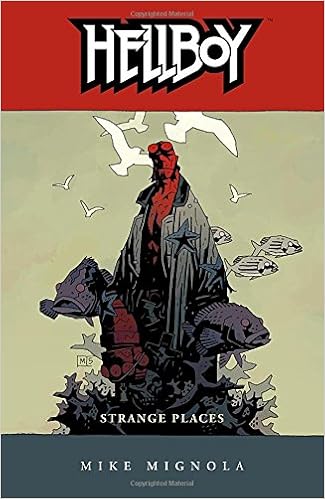
Below you can see a few examples of Mike's Hellboy drawings. The majority communicate distinctive elements of Hellboy character such as the dark colour scheme of reds and Black's with the gothic typeface. As a group we discussed representing Hellboy as the main visual elements as Mike is mostly famous for his creation of Hellboy, therefore these well-known characteristics and features of Hellboy would need to be strongly communicated within the branding to ensure instant recognition by the users, and to be used as an incentive and a deal breaker for the user to attend the event.
Tuesday, 7 February 2017
EP // BRIEF1 // CREATIVE NETWORKS // WORK ALLOCATION
The allocation of the work was first set up so everyone could have a chance to produce work and this avoided anyone being left out. First, the concept was tackled by the whole group to generate and explore as many opportunities and avenues as possible, this, in essence, creates a collective system of opportunity and understanding of the brief and for what and whom we were working towards in regards to the target audience, Mike Mignola, and Creative Networks. Once we were comfortable and happy with the directional approach of the concept we were then able to allocate the work between us to suit our area of focus, whilst also saving a lot of time. Once the concept was confirmed we decided to tackle the poster first as a group and then once the poster was complete this would then inform the rest of the event collateral. The collateral paraphernalia we decided to create was a series of posters, flyers, leaflets, vinyl for the bar and the animated introduction to present the speaker. Once the posters were complete we began to allocate the work amongst ourselves. Rhys worked on the vinyl and leaflets, Lo worked on the flyers and also making sure that all collateral was consistently floorless throughout, this included making sure all the colours matched and the sizes and image quality continued to portray a certain degree of professionalism. Lastly, I worked on the digital elements, and this included the animated creation of a short 10 seconds introduction.
In conclusion, we made a conscious attempt to make sure that everyone had something to do and this is another reason why we all tackled posters together as this gave us a chance to experiment with different styles and aesthetics while still considering the conceptual approach and implementation of all design decisions whilst still injecting a credible and professional tone of voice to represent the college and the speaker.
In conclusion, we made a conscious attempt to make sure that everyone had something to do and this is another reason why we all tackled posters together as this gave us a chance to experiment with different styles and aesthetics while still considering the conceptual approach and implementation of all design decisions whilst still injecting a credible and professional tone of voice to represent the college and the speaker.
EP // BRIEF1 // CREATIVE NETWORKS // TARGET AUDIENCE
In regards to the target audience of the campaign, it was somewhat important to understand who the branding would be aimed at. You can begin to explore whether or not it's more important to represent the target audience in order to persuade them to attend or to represent the speaker as an incentive to attend or will it be both. Understandably, the main audience would be from the creative sector but also students from the University, as the branding would be presented and seen within the University the main audience would be students from the Uni. Other then the college the Creative Networks event will attract a number of people from around the Leeds area and also other students across a range of universities. In terms of the target audience, the event collateral would be presented in a way to attract and appeal to the intended audience to want to attend the event, this could be delivered in regards to design aspects such as colour, imagery and typography but also other areas such as how the concept would be presented and promoted.
You have to look at two scenarios when approaching the target audience for an event. There is a certain proportion who are there because they are already familiar with the speaker and people who don't know the speaker and/or doesn't realise the event is happening. People who are there because they are a fan of the speaker won't necessarily be affected by the branding as their brains are already decided they are attended. The other demographic will have to be persuaded to attend or be made aware of the event if they don't know what's happening.
It's also extremely vital to represent the speak in a good light. Sloppy design and promotion of the event and speaker could damage the reputation of the Mike Mignola and inevitably snowball to also damage the reputation and credibility of Creative Networks as an event and the university. It's important if not more important to make sure the branding and concept is professional, and a successful representation of Mike Mignola and his contribution to the industry.
EP // BRIEF1 // CREATIVE NETWORKS // BRIEFING
Today, Joshua Edgington briefed the Creative Network Project. Even though elements of the brief were somewhat confusing, the brief was situated around the promotional and branding of Creative Networks. Creative networks are 'Leeds College of Art's major professional events program with talks from a diverse group of high profiles speakers from across the creative industries to entertain, challenge and to make us think'.
The brief instructed us to take the next speaker, Mike Mignola who will be speaking at LCA on the 3rd of November and to create a concept to essentially promote the night. We had to also promote another speaker who we would like to see at the next creative networks talk. I felt this requirement was to see how the branding could be universally applied to all speakers but with individual elements within the concept to represent each speaker. In regards to creation, we had to create a series of posters and one or two other pieces of collateral material such as leaflets or flyers. We were also asked to consider other elements of the promotional material such as the introduction animation that would introduce the speaker and the wayfinding aspect to ensure the event is easily navigated to and from.
The brief instructed us to take the next speaker, Mike Mignola who will be speaking at LCA on the 3rd of November and to create a concept to essentially promote the night. We had to also promote another speaker who we would like to see at the next creative networks talk. I felt this requirement was to see how the branding could be universally applied to all speakers but with individual elements within the concept to represent each speaker. In regards to creation, we had to create a series of posters and one or two other pieces of collateral material such as leaflets or flyers. We were also asked to consider other elements of the promotional material such as the introduction animation that would introduce the speaker and the wayfinding aspect to ensure the event is easily navigated to and from.
EP // BRIEF1 // CREATIVE NETWORKS // GROUP DECISION
For the creative networks brief, we were recommended to form ourselves into groups to ease the work pressure but if we wanted to we could work on our own. Due to the pressure of cop, especially the dissertation, looming above my head the realistic choice was to get into a group to improve the chances of winning.
My group consisted of me, Rhys and Lo; even though all three of us were close friends we all have a variety skillsets and area of Interest. Rhys's interest is within Branding, Lo's specialist is editorial and mine was digital. Together as a team, we had the opportunity to combine all areas of interest to muster up a number of ideas and concepts from a range of perspectives.
The other benefit was that nobody was shy or afraid to speak up or defend their own work and decisions, yes, we are all friends but we were all at a level of comfort in which we all respected our own creative differences. Essentially it's better to have an effective and serious discussion without any judgement than to be shy to speak up and put forth any suggestions or constructive criticism.
Subscribe to:
Comments (Atom)